Introduction
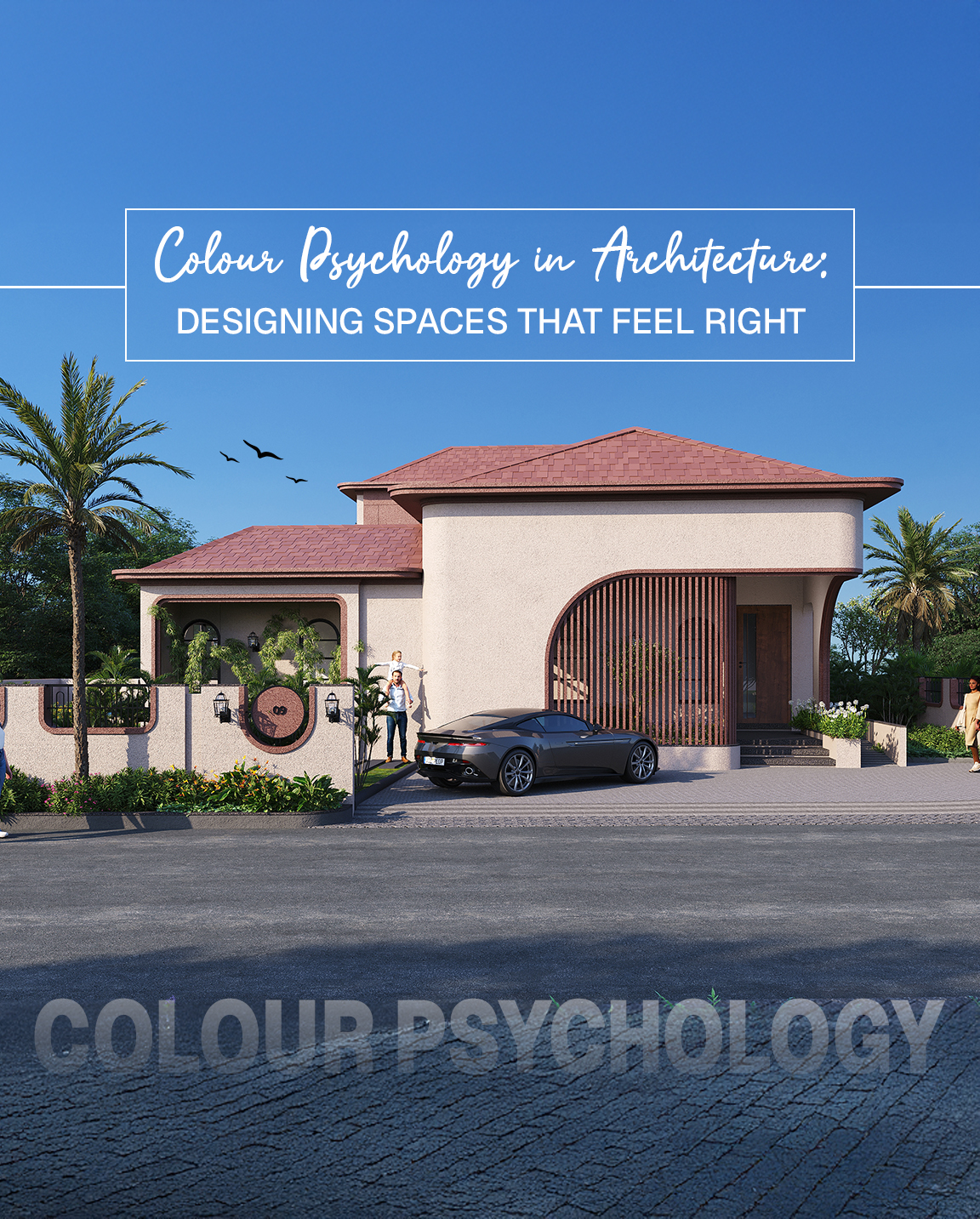
Colour is more than just an aesthetic decision—it’s an emotional language. In architecture and interior design, colour plays a vital role in shaping how people feel, behave, and interact within a space. Whether it’s a calming bedroom, a focused workspace, or an energizing lobby—colour psychology in architecture is about choosing shades that serve a purpose.
In this blog, we’ll explore how colours influence human psychology and how Indetail Design Studio uses this knowledge to create mood-enhancing environments in both residential and commercial projects.
What is Colour Psychology in Architecture?
More Than Just Paint
Colour psychology is the study of how hues affect human emotions and behavior. In architecture, it’s about using colour intentionally—on walls, furniture, floors, and even lighting—to achieve the desired psychological outcome.
Why It Matters
From boosting creativity to reducing anxiety, colour influences everything from productivity to relaxation. Good architectural colour planning ensures every room doesn’t just look good—but feels right.
How Different Colours Affect Space and Mood
Blue – The Calming Influence
Used in bedrooms, offices, and spas, blue brings a sense of calm and focus.
- Best for: Bedrooms, study areas, conference rooms
- Emotion evoked: Serenity, productivity, clarity
Yellow – The Joy Generator
A bright and uplifting colour that inspires optimism and creativity.
- Best for: Kitchens, children’s rooms, creative studios
- Emotion evoked: Positivity, warmth, energy
Green – The Balancing Act
A favourite in biophilic architecture, green promotes relaxation and connection to nature.
- Best for: Living rooms, waiting areas, workspaces
- Emotion evoked: Renewal, harmony, freshness
Red – The Energy Booster
Strong and powerful, red stimulates appetite and draws attention.
- Best for: Dining areas, cafes, or accent walls
- Emotion evoked: Passion, urgency, vibrancy
Neutrals – The Elegant Base
Beige, white, and grey act as timeless backgrounds.
- Best for: Any space when paired with accent colours
- Emotion evoked: Simplicity, balance, sophistication
Colour and Spatial Perception
Did you know that colours can manipulate the perception of space?
- Light colours make rooms appear larger and airier
- Darker shades add intimacy and drama in large spaces
- Warm tones advance, making walls feel closer
- Cool tones recede, adding visual depth
Architects use this technique to optimize compact areas or balance oversized rooms. It’s especially powerful in urban homes and apartments.
Commercial Architecture and Colour Strategy
Branding Meets Emotion
In commercial architecture, colours go beyond aesthetics—they support brand identity and customer behavior. For instance:
- Blue promotes trust in financial institutions
- Red and orange stimulate appetite in restaurants
- Green and beige create a relaxed feel in salons or wellness centers
Office Productivity Through Colour
Indetail Design Studio uses colour zoning to create focus zones, creative areas, and breakout spaces—each with its own colour palette to support the intended function.
Cultural Relevance in Colour Selection
In India, colour carries deep cultural meaning:
- Yellow signifies purity and knowledge
- Red is associated with celebration and energy
- White is often linked to peace and spirituality
Our architectural designs respect local traditions while balancing global sensibilities—creating spaces that are emotionally resonant and culturally aligned.
How We Apply Colour Psychology at Indetail Design Studio
Every project begins with a conversation—not just about aesthetics, but about how clients want to feel in their space.
Our process includes:
- Colour consultations based on client personality and lifestyle
- Moodboard presentations
- 3D renders to preview tone combinations
- Suggestions for natural and artificial lighting to complement the palette
Explore our residential interiors
Book a consultation
Final Thoughts
Colour is the silent voice of architecture. It guides mood, enhances purpose, and connects people to space in an invisible but powerful way. By understanding the principles of colour psychology in architecture, homeowners and business owners can create spaces that not only look beautiful—but also feel deeply comforting, energizing, or inspiring.At Indetail Design Studio, every colour is chosen with intention—because we don’t just design spaces, we design experiences.


